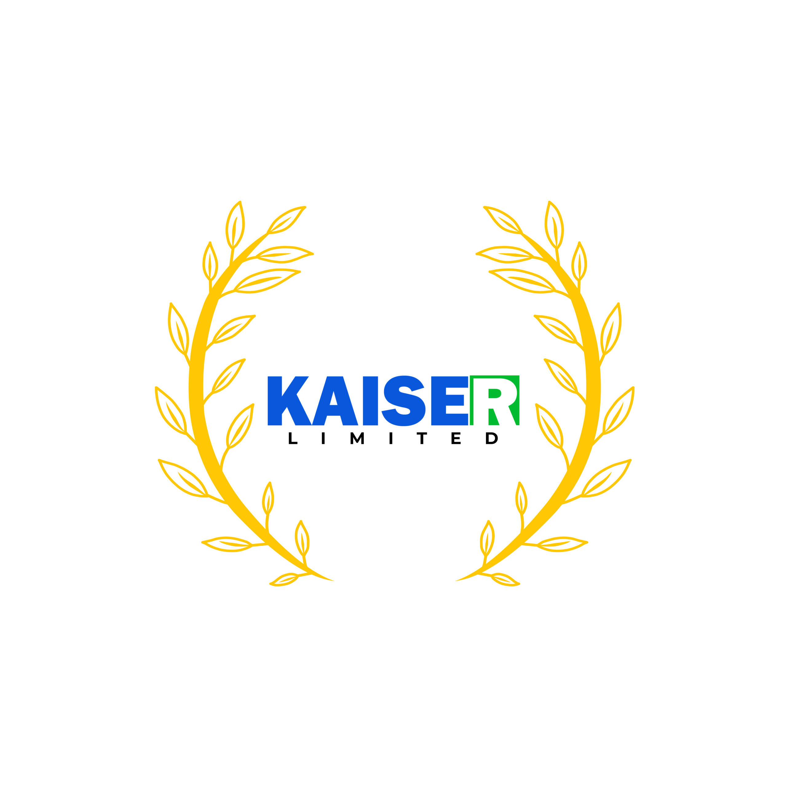
– Created a sharp wordmark using bold sans-serif type for a modern feel
– Framed the logo in a laurel wreath to convey prestige and trust
– Highlighted the “R” with a contrasting green to add visual interest and symmetry
– Chose a blue-and-green color palette to communicate reliability and growth


